
Colin Campbell, Copywriter
colin@colin.org 408-370-6521
Content analysis for tech companies
A lot of the tech sites I look at have their essential content buried behind a barrier of complex technical writing.
What I do as a technical copywriter is to is to emphasize the unique selling points that set a company apart from competitors.
I analyze a company’s content from the point of view of the visitor.
The first thing a visitor wants to know is, what is this company offering? With a lot of tech companies it’s hard to find out.
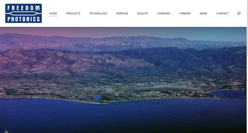
For instance, here’s a Goleta tech company I recently encountered. What’s their unique selling point?
Everything in the menubar is is utterly generic. It stays this way for many long seconds until their name slides into the picture: “Freedom Photonics. Photonic components and modules.”
Then pictures of their products slide across the screen.
Each page displays for 9 seconds in a 36-second rotation.
Clicking on these pictures does not take you to further information. You are expected to already know everything about these devices.
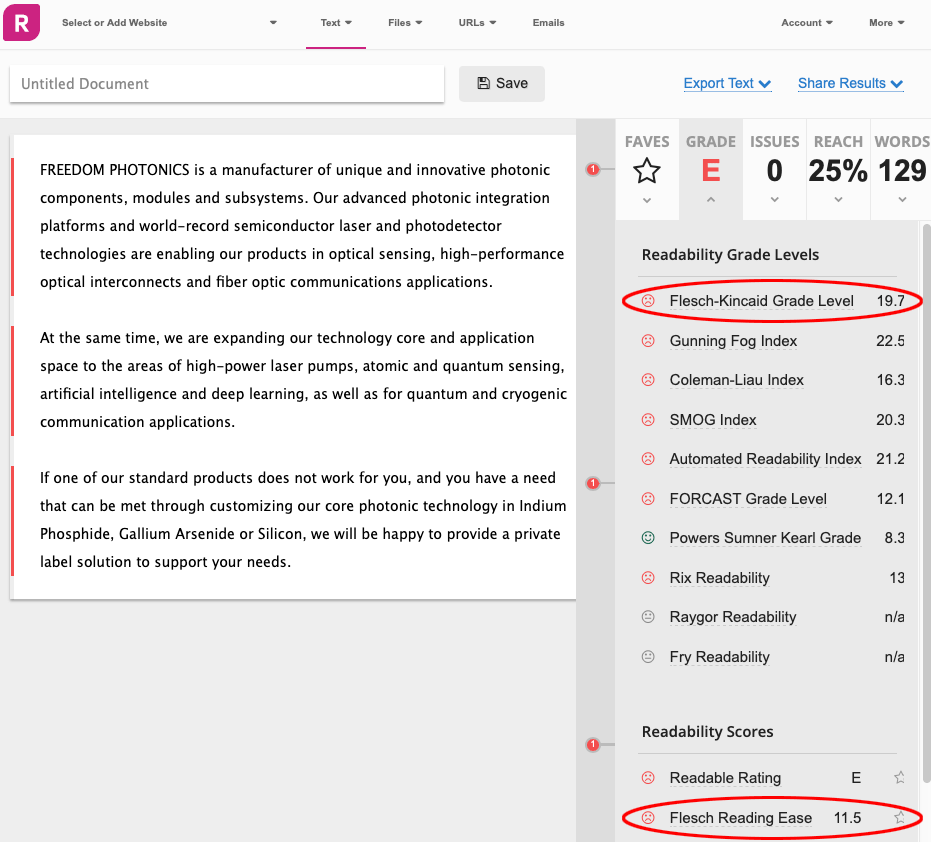
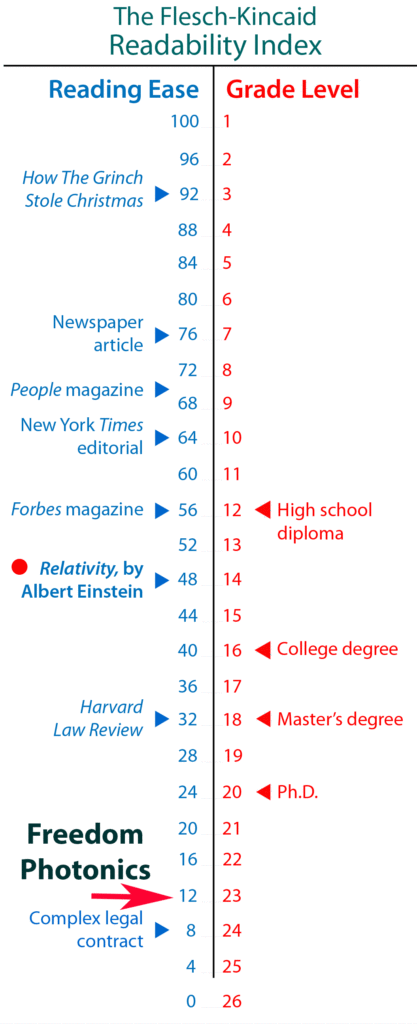
When you scroll down the home page you find 129 words of text about Freedom Photonics. This text is unnecessarily complex and hard to read.
One of the first things I do in content analysis is to run the text through a Flesch-Kincaid Text Readability app:
This introductory text scores at Grade 20, Ease 12, and it is essentially verbless: the company does not describe itself or its products as doing anything.
The text is similarly passive and abstract throughout the site. The sentence structures are mere padding around information that should have been presented as bullet points.
The text makes claims that are not substantiated anywhere on the site:
Unique, advanced, world-record.
Elsewhere on the site they say “We specialize in unique and innovative components for a variety of applications.”
I searched their site for the word “innovative” and every instance was the same empty claim with not one mention of any innovation.
What makes them different from everybody else in the photonics industry?
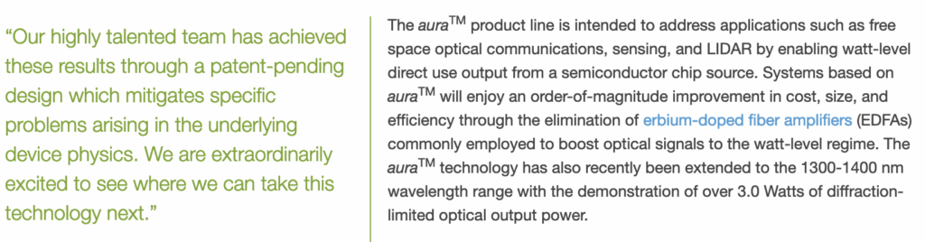
They think they have explained their product by giving it a name. Their breakthrough product line is called Aura™, and that’s all you need to know!
This information isn’t on their site, however; it’s found only on a press release aggregation site somewhere else on the internet. The left-hand pull quote in hard-to-read light green tells you nothing at all except for their opinions about themselves.
In the right-hand column, the text in blue is a link to a Wiki article and is not anything the company itself is saying.
Their products are so good they recently set a new world record, but it’s up to you to do the due diligence to find out what they’re talking about.
Although this company has an important tech breakthrough, you can’t find out about it on the landing page. It’s barely mentioned anywhere else, and where it’s mentioned, it’s not explained. For an explanation you have to go to a PR aggregator site.
A website called Tracxn informs me that as of March 3, 2022, there are 276 photonics startups in the United States making products for use in seven or eight market segments. A Buyers Guide at optics.orp lists 311 key suppliers in the photonics market. It’s difficult to stand out in such a crowded marketplace.
The company has no interest in making it easy for you to find things out. You have to do the due diligence. But the site gives you no incentives.
The text is unnecessarily hard to read and gives the reader no reward for reading it. The information is bullet points crowded into a sentence format with inactive verbs clogging up the flow.
It’s a placeholder site. Visitors are not expected to read it. This is the kind of site where I could make a lot of fast improvements as a technical copywriter.
ADDENDUM:
But, what do they need me for: after I started looking at their site, they were bought out by Luminar. They won’t ever have to bother with a website again.