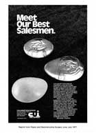
Mr. Cox and Mr. Uphoff quit their jobs at a silicone breast company in Santa Barbara to start their own fake boob company. They hired an art director to create their first ad, and he called me to fill in the body text--the headline was already set in stone, "Meet our best salesmen," and the graphic was already designed: a photo of three turds on a plate. |
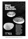 |
All I had to do was fill in the details. I argued against it, but they said they didn't really want the first ad to have any effect, it was just to let the medical universe know they were in existence.
I guess the ad had even less affect than they expected, because for the next ad they pretty much went along with anything I suggested. |
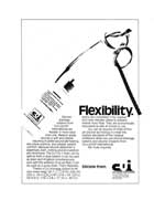
But the first CUI ad...grumble, it's the one where I set things up at the photo shoot and then left for another appointment, and art director John Alexander wasn't esthetically pleased by the shape of the knot I'd tied in the surgical drainage tube, and he untied it and re-tied it the way he liked.
635pm
It killed one of the subliminal features of the ad: our target audience was surgeons (the ads ran in medical journals). The benefit of the product was that it was very flexible, unlike competitors' surgical drainage tubes that were more stiff like drinking straws--very uncomfortable for the patients, and also more prone to displacement of tissues when the patient moved and thus more prone to infection.
To demonstrate how flexible our surgical drainage tube was, I tied it into a surgeon's knot. Every surgeon would recognize the knot.
Unfortunately, art directors didn't.
Well, it was still a strong ad. It worked really good.
But now looking at it today I'm freshly furious about the text layout. I don't remember now if I lobbied against the layout back then...I can't even remember what year it was. 1980, maybe?
No, checking it again I see ©1977.
That's right, I did the CUI work before departing to take the BBDO job. It was part of the good work that went into the portfolio BBDO hired.
John was always completely copy-blind. The text was just a gray block on the page, one more design element. He didn't care a bit what the text said. It's all just an indistinguishable blob of text with no help to the reader to get into the story, no bold sub-heads to point out major benefits.
But it's clear from this CUI ad that I had attained my full strength in text and concept. In a magazine full of generic "We Are The BEST!!" ads, the FLEXIBILITY ad really stood out, and if you defeated the blandness of the typography and read the text, it was very informative and persuasive. So it generated some response.
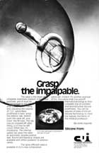
Yeah, maybe this is where I could start. That was FLEXIBILITY, and then for the final ad they were finally ready to reveal their secret, a silicone breast implant with a tab on it that would let the surgeon always have a tactile sense of the implant's exact position inside the bloody incision, and the ability move it at will, combined with the fact that the tab could never be noticed by anybody post-surgery.
8pm
My headline was GRASP THE IMPALPABLE. It generated lots of interest.
But it expended the CUI ad budget, I guess, because I didn't hear from them again for a couple of years. CUI had grown and expanded in my absence while the ad agency cranked out "normal" ads and stuff. Colin's crap is too crazy for most clients, I guess.
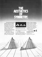
Then a few years later the company had a new product outside of the guidelines, and the agency called me in for one last ad. They didn't know what to do with the new thing, a tool that let a bloody-handed surgeon able to make a swift and accurate estimate of the volume of a new fake boob without having to do an expensive MRI scan.
The product that the agency sent me was a collection of three different-sized circles of flexible plastic. The ad agency was unable to understand what these circles were for. I went to the technical staff at CUI and asked them, and they explained it clearly for me, and my solution was to present a photo of the circles as they would be deployed in use: coiled into cones of different diameters. Numbers printed on the circles displayed volume in milliliters at the current displacement.
That ad won a bunch of awards. The company's fortunes expanded to such an extent that they had to increase the size of their factory, except the City Fathers of Santa Barbara forbade them from any expansion.
So they moved to San Diego, leaving me behind. As always. The Santa Barbara curse. |