|
||
|
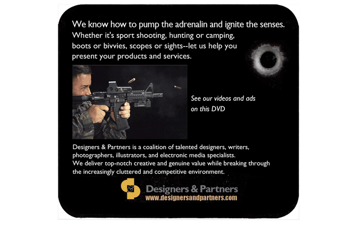
Throughout my copywriting career I've been privileged to work with some great art directors, but I've also battled many of them who were "copy blind"-- my term for graphic designers who see text only as another design element on the page, with no regard for the readability of the text. They don't read it themselves. It doesn't matter what the language is. They wouldn't be fazed if the text were in German or Swahili or Urdu or Kanji: they'd go about their design process in the same way. It's the graphic look of the piece that they care about, completely aside from the meaning of the text. A copyblind guy I know complained about the lack of response his video reel generated at the SHOT show in Las Vegas. When he talked to people on the convention floor and showed them the reel on his laptop, he got a strongly positive reception. He does good stuff. But he never got a single response from the hundreds of people who received a DVD. "Let me see your DVD package," I said. The cover and the inside insert were the only information in the package, and they demonstrated his copyblindness. I told him that nobody would read the text. I didn’t have to read the text to know that nobody would read it. The text is a featureless blur:
|
Previous posts: The technology of text Is your brochure easier to read than Einstein's "Relativity?" They expected me to copywrite ads for free. Is copywriting dead, or is it just me? 10 ways to make a visitor read the text on your web site. Clear, simple text for your company's site.
|
|
And if you do power your way through it and read the text, it turns out to be empty self-puffery that doesn't give you any understanding of what you will see if you look at the reel. It presents no evidence of why a busy person should take ten minutes out of their life to look at the reel. Here's my copywriter's rough of how I would have done it. I used only the information from the existing text and. Also, I was able to look at the actual video reel and select a picture:
|
||
I did the work of selecting out just a few words and giving them different weights. I pared it back from 160 words to 65 words. Maybe if they use my version next year they'll get more response. The copy blind are interested only in graphic presentation, not information presentation. The message of the text is irrelevant to them: these are the words that the client gave us and that's what we're working with. They take it for granted that the reader/visitor is required to read it. Helping them read it is not part of the copy-blind designer's job description. The only function of text is to attract the attention of the search robots. In the world of the copy blind, normal humans are not interested in text. A relic of the past. So they present the text perfunctorily. For many people--many customers--reading is a lot of work. Copywriting paired with design can dictate the path that a reader takes through the information. Text is interactive: it requires the participation of the reader. We can make it easy by appealing to potential customers with a straightforward presentation of written factual information. Here are some more examples of copy-blind design, all of which scream DON'T READ ME! |