How I optimized the gallery’s Call for Entries.
I met with Skip Lau at The Coffee Bean and he explained to me what the brochure was supposed to accomplish.
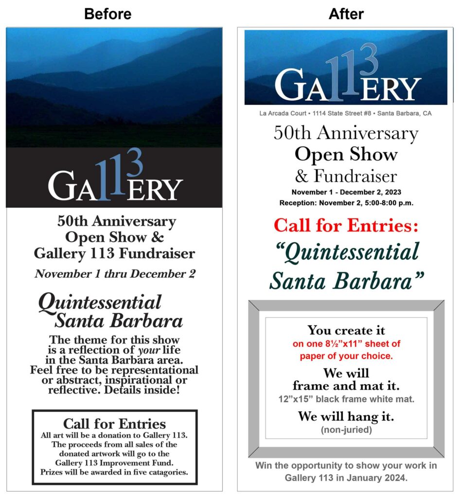
First of all, it was supposed to be a Call For Entries, but I pointed out that it was deprecated to the bottom of the page on the cover.
I promoted that to be the first thing your eye picks out on the page by making it red.
The cover demurred about everything else and said “See inside for details,” but the details were all buried in the fine print inside. I moved the important details to the cover.
I had to ask a lot of questions to find out which details were important because I know nothing about the art gallery universe. For instance, I was unfamiliar with the term “Open Show.” Google told me:
“An ‘open show’ allows anyone to submit their work, which is accepted unconditionally and unjudged.”
Skip told me that the show is non-juried so all entries will be hanged. However, there was zero mention of this in the existing brochure. So I put it on the front page of the web version.
I was unfamiliar with size limitations in art shows. For this one, all entries had to be on a single 8-1/2 x 11 sheet of paper. It was barely mentioned in the original brochure but I decided to make it a feature on the cover.
I made it clear: you create it, we’ll mat and frame it, and we’ll hang it.
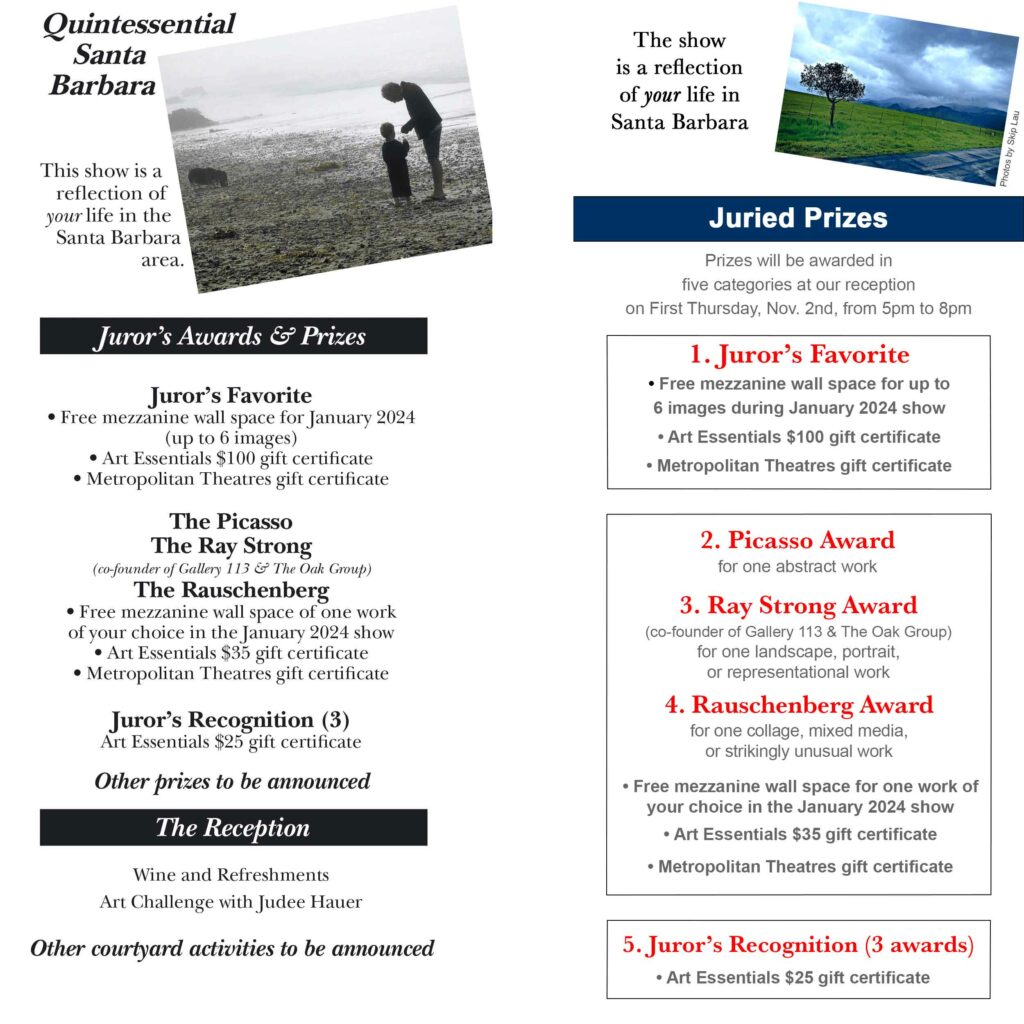
Another thing I did not know is that art galleries rent wall space to artists. The incentive for submitting to this show wasn’t the gift certificates to the art supply store, it was: your piece of art on the walls of our gallery for one month.
I tried to compress as much information as possible into the cover panel while also reducing the number of words and making it easy for the eye to follow the sequence of ideas.